Bearfoot Publication Design
To create a fictional magazine branding system, including a wordmark, text and image rules, and an applied composition showing covers and how a few articles might look fleshed out.
Objective

Brand Identity
Big Idea
Bearfoot is a new way of thinking. Bearfoot is a place where there is no judgement and only a drive to live a intentional life with nature and wildlife in mind. It is down to earth and realistic in expectation, but nonetheless idealistic of a world without crippling pollution of the earth and the mind. Bearfoot strives to educate about the earth and what we can do to improve its condition. Bearfoot is our collective future.
In Short
It is learning to live a mindful and sustainable life. It is raw and messy community-focused change. It is Bearfoot.
Some Words to Describe Bearfoot
Sustainable
Raw
Messy
Home-grown
Green
Mindful
Natural
Untamed
Some Words that DON’T Describe Bearfoot
Corrupted
Trendy
Toxic
Synthetic
Techy
Confined
Perfect
Polluted
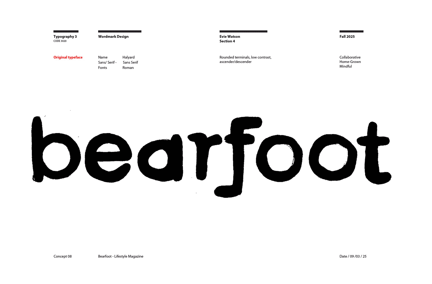
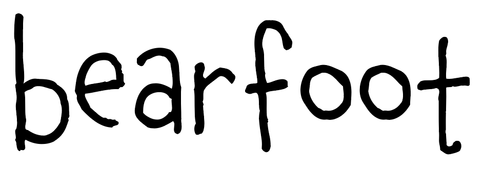
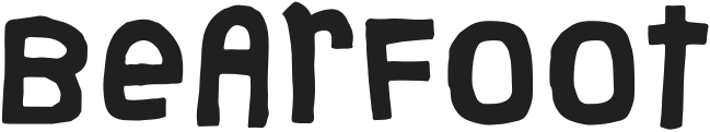
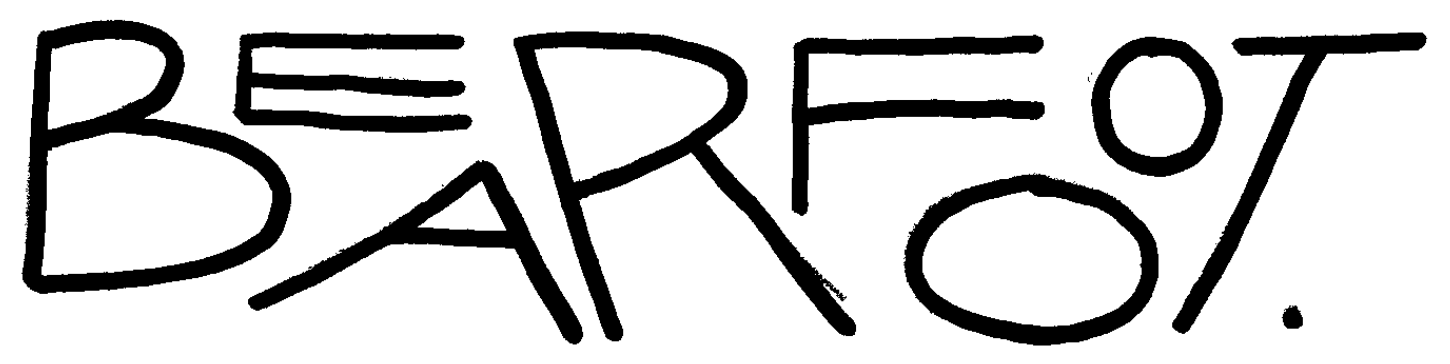
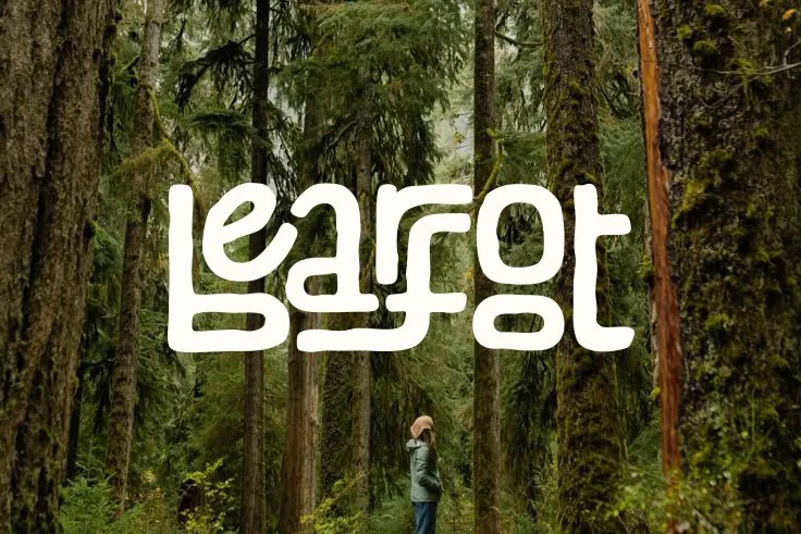
Wordmark Process
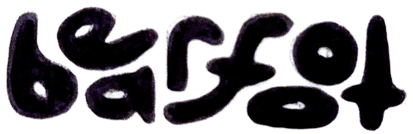
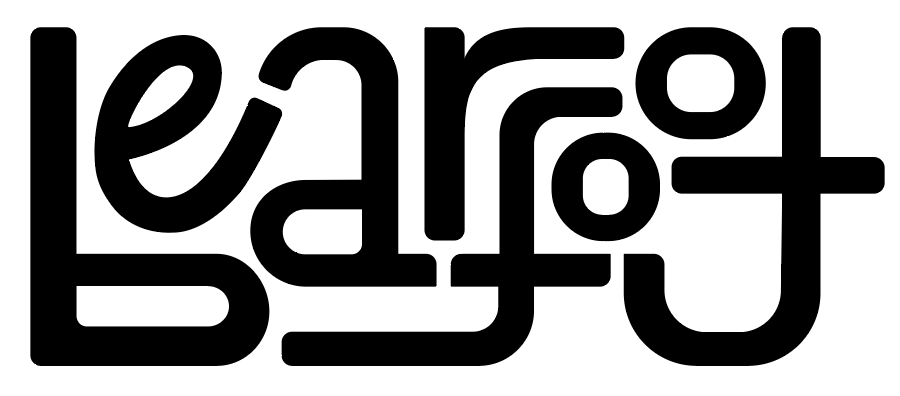
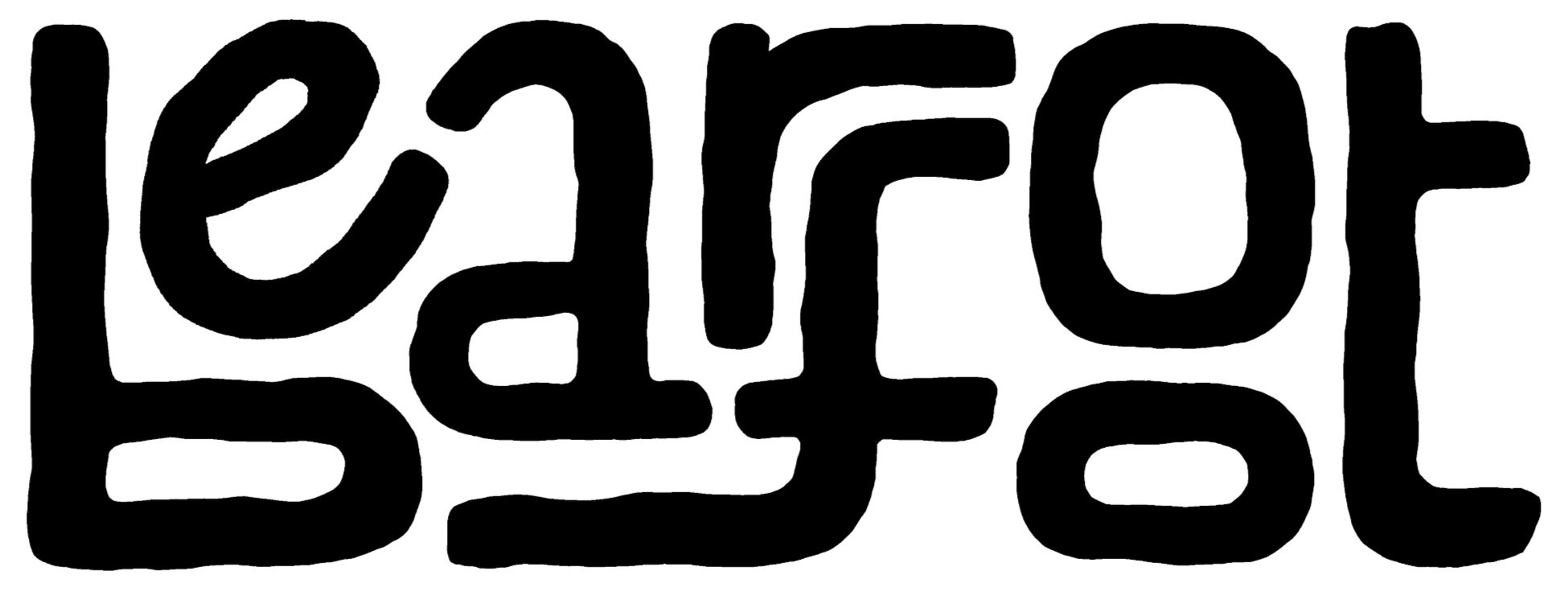
Typeface Exploration
Explored tweaking can typefaces by hand using ligature, tracking, stress, rotation, rounding, etc.
Over 50 different wordmarks were completed in this process
Prominent Stages of Development
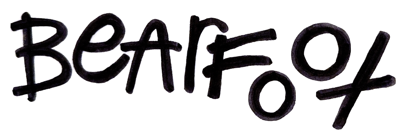
Final Wordmark
I ended up not utilizing a base typeface, and completely creating my final wordmark by hand. I used Procreate to create the final texturized piece.
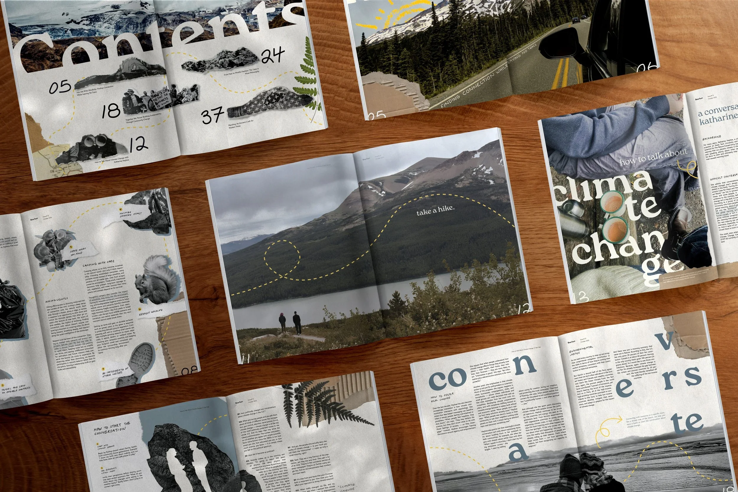
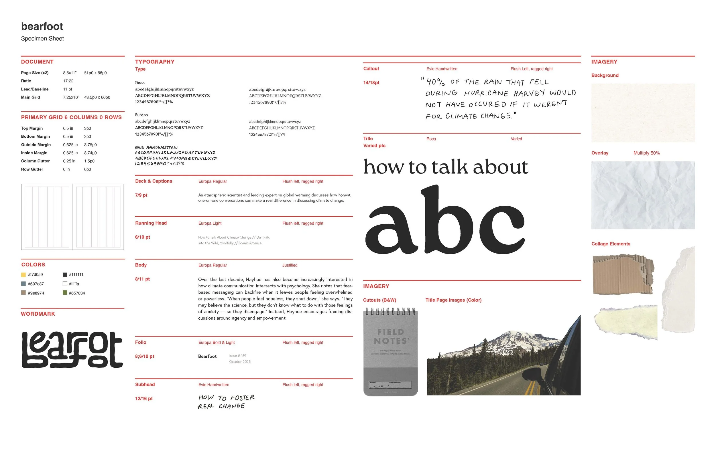
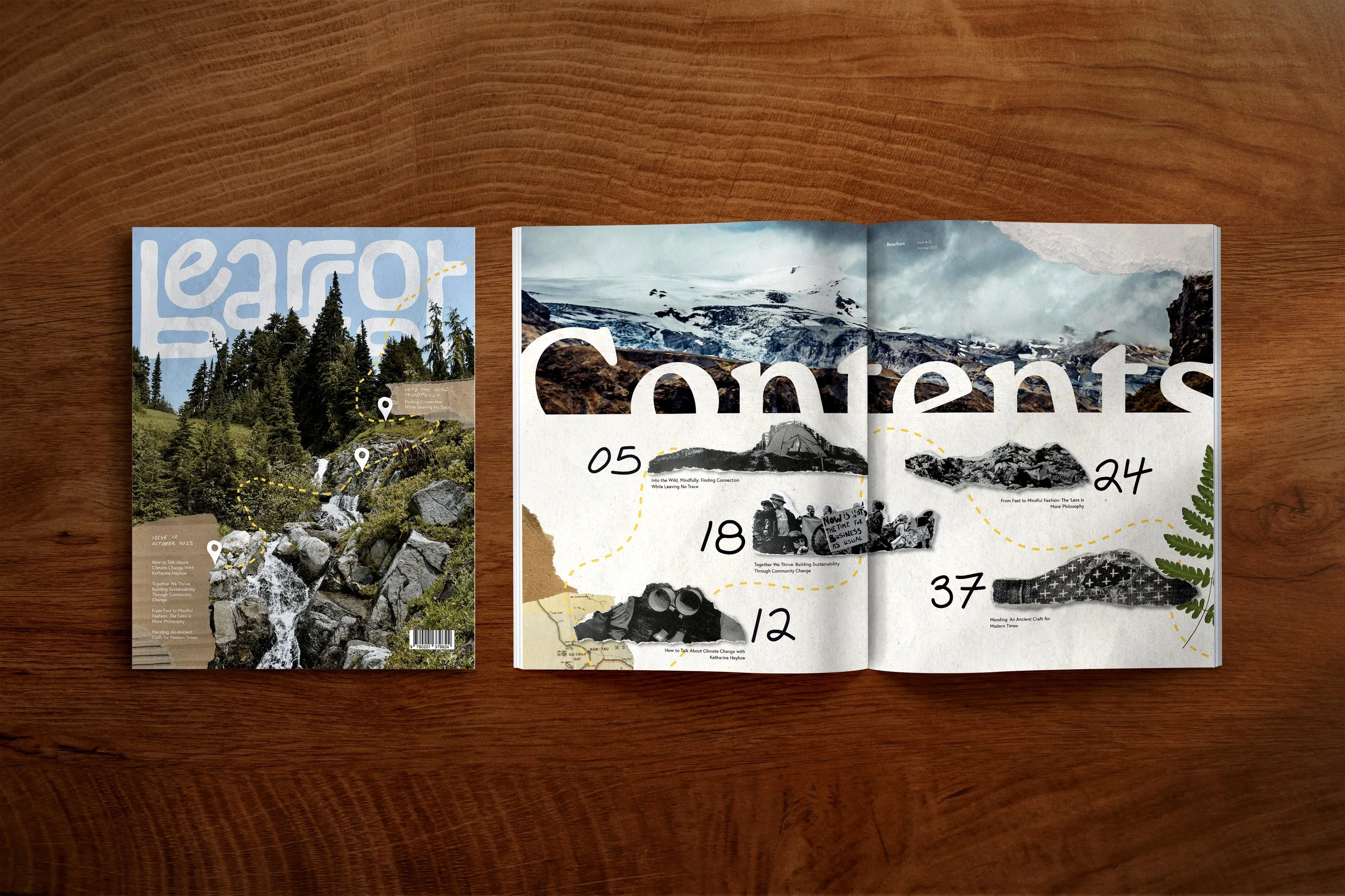
Publication Process
B&W Layout Exploration
Started by exploring minimal type-only layouts, then progressed to adding color and photo.
Adding Image and Color
Developing a Branding System
Final Concept Direction Refinements
Final Publication
You Might Also Like…
-
![]()
Bearfoot Publication Design
-
![]()
Typographic Poster Sequence
-
![]()
CD & LP Design
-
![]()
Atlanta Airport Interface
-
![]()
Gallery