Atlanta Airport Interface Design


To begin, we were given a long list of flight information, ranging from destinations to gate numbers. The task was to successfully organize this information into a system that would be the most intuitive to the common phone user. The first set of brainstorming was for the arrivals page.
First Set of Ideations


For the second set of brainstorming, I started implementing line, shape, and value. I focused on the interface as a whole, ideating for the arrivals, details, and airport information pages.
Second Set of Ideations


For adding color, it was important to make sure the colors branded this project in some way, shape, or form, but they were tame and uniform enough to still convey the necessary information.
Adding Color
Palette #1:
Palette #2 (Chosen):
Palette #3:
Final Panels
Finalizing this project meant bringing everything together. In Figma, I imported all of my designs and animated them to connect for the end product.

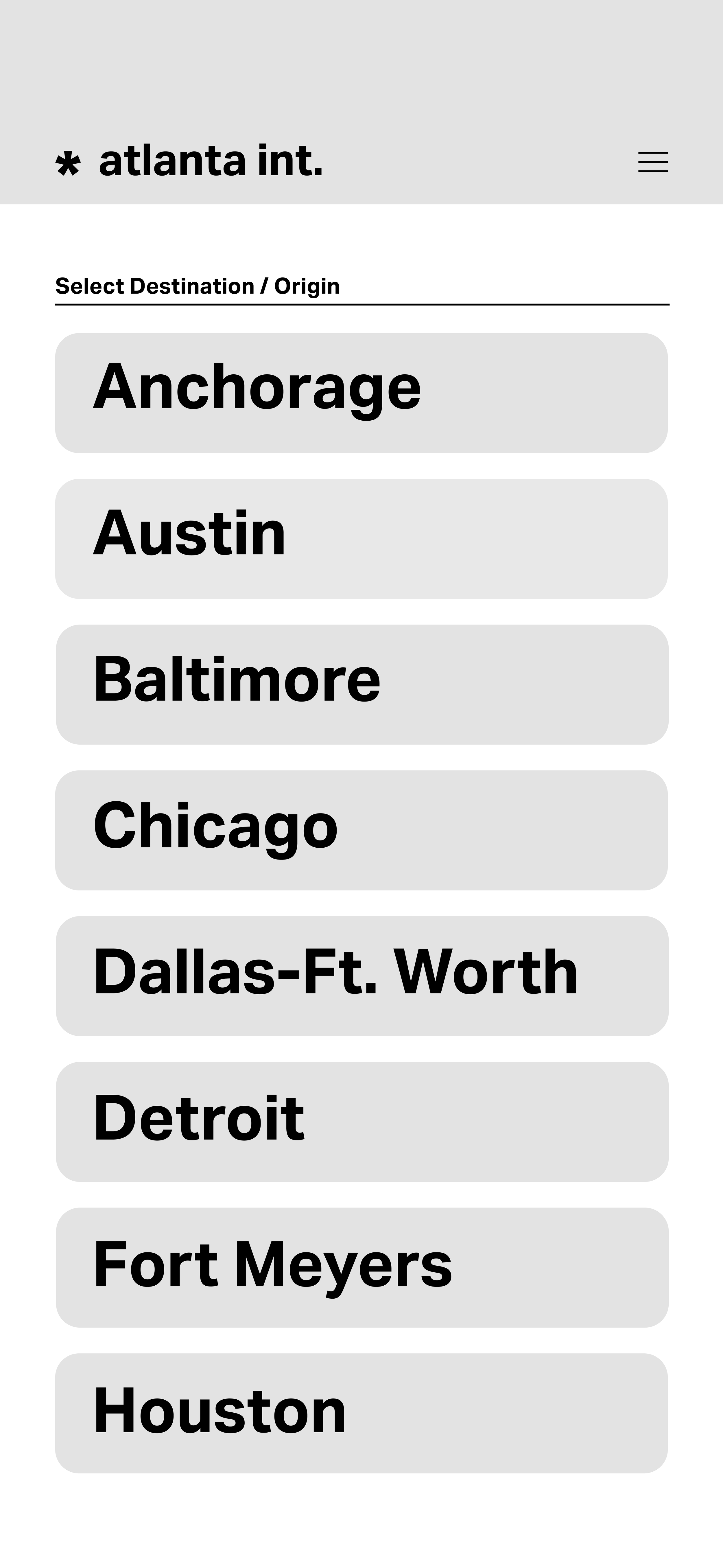
Destination List


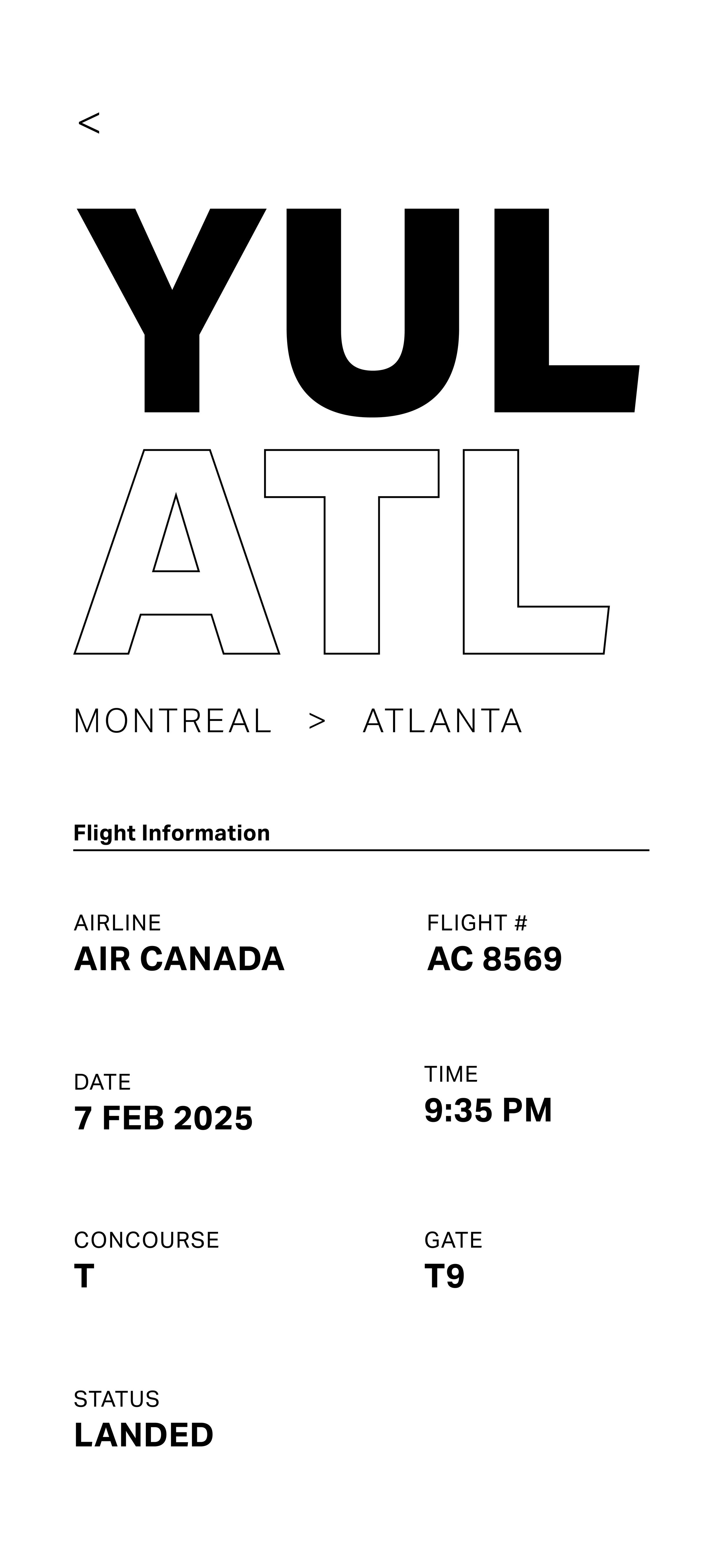
Flight Departures
Dropdown Menu


Navigation Panel
Airport Information


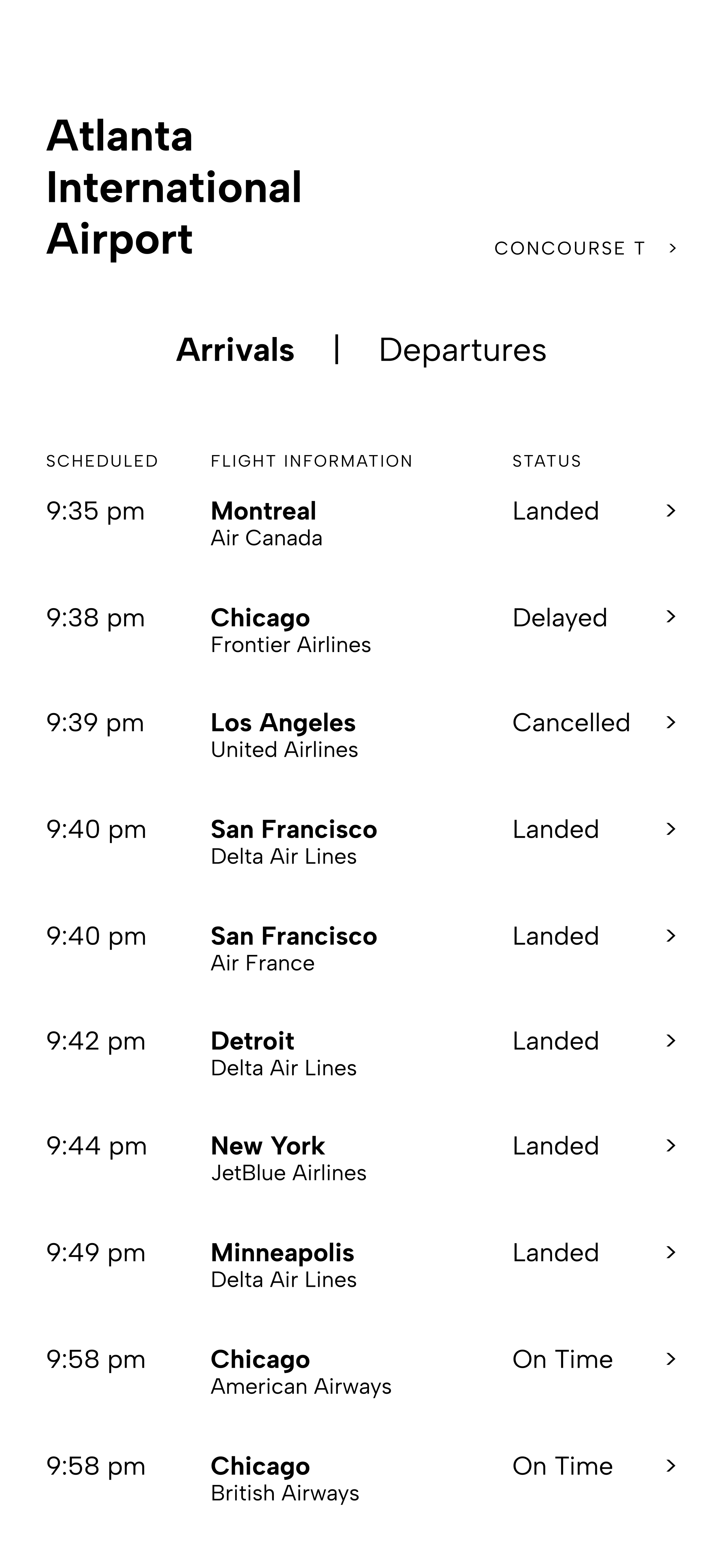
Flight Arrivals

Redirection Page
Typeface Used:

Hex: #3D528F
Hex: #E3E6ED
Hex: #FBF7F4
Hex: #EBC894
Hex: #F4E2BE
Interactive Link
This interface employs tabular hierarchies, a typographic system, and ability to translate & incorporate different viewing scales.
The objective of this Informational Typography project was to create a hypothetical FIDS (flight information display system) for the Atlanta Airport. This FIDS is designed to be viewed on the phone to communicate flight information to passengers in real-time.
Objective
You Might Also Like…
-
![]()
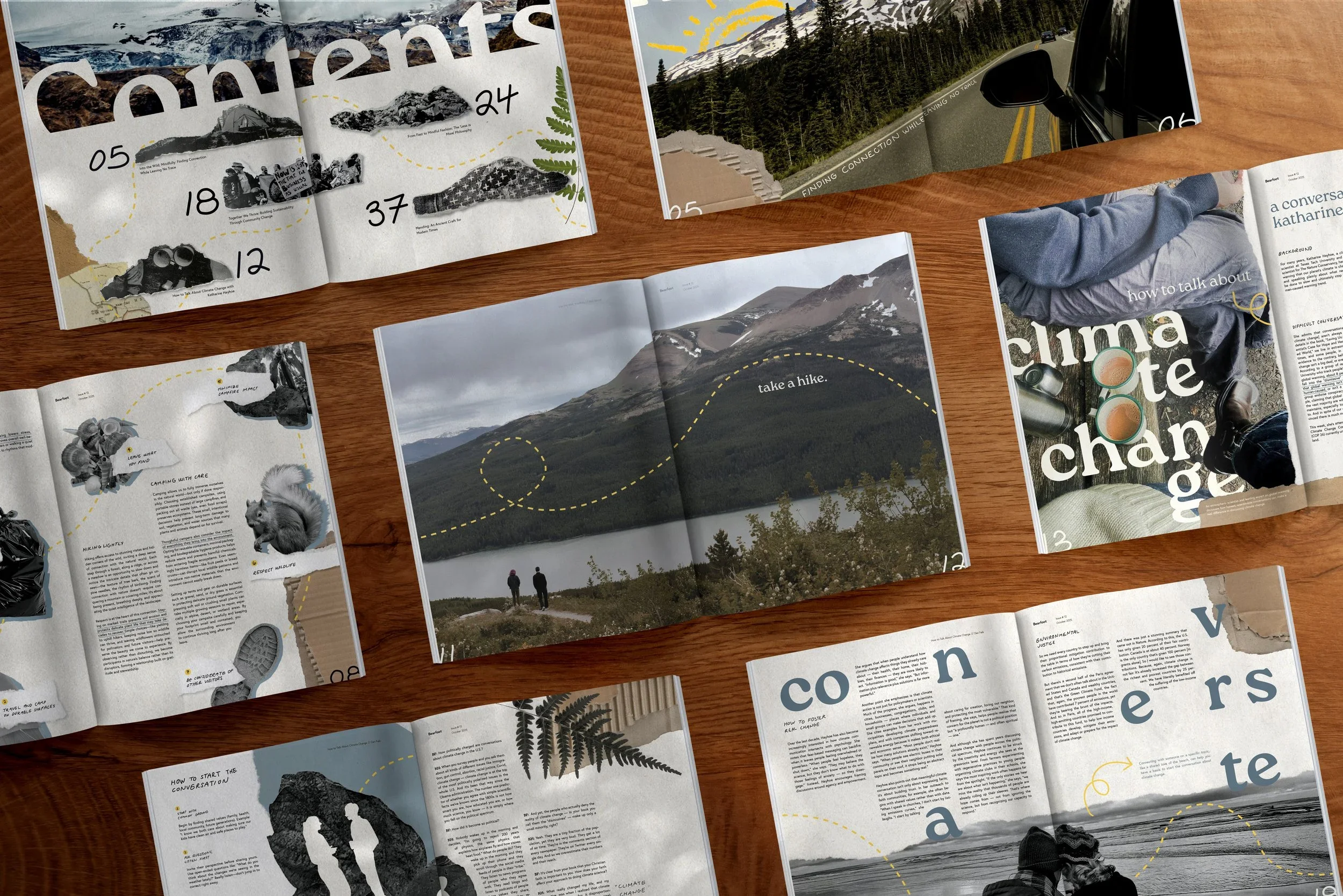
Bearfoot Publication Design
-
![]()
Typographic Poster Sequence
-
![]()
CD & LP Design
-
![]()
Atlanta Airport Interface
-
![]()
Gallery